Snack & Dine
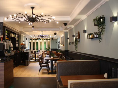
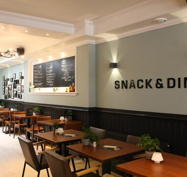
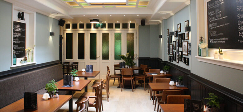
We created an interior design for the proposed reconfiguration of a traditional pub/restaurant with separate cafetaria into a single combined modern fast food restaurant. An L-shaped space is achieved through the removal of a wall. The design for this space provides for clear interventions and elements:
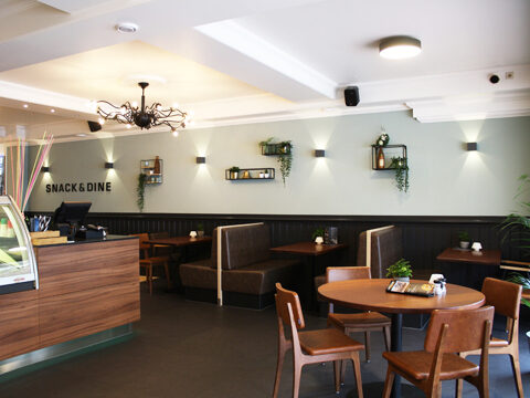
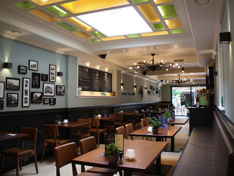
– Revealing the previously hidden roof light introduces a more conservatory-like feel for the rear of the restaurant due to the penetrating daylight. The remaining coloured glass directly influenced the colour scheme.
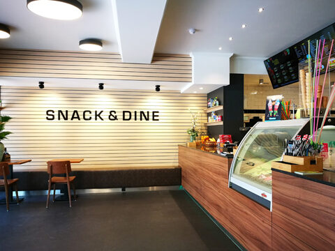
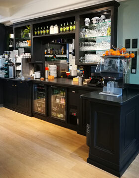
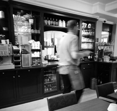
– Due partly to its overall length, the spacious and stylish bar with integrated ice cooling acts as a real statement within the space. It defines the separation between the cafeteria and the restaurant, but also connects them. The open kitchen lies behind this.
-The almost graphic slatted wall for the take-away section imparts a modern look and atmosphere and has an exceptionally spacious effect.
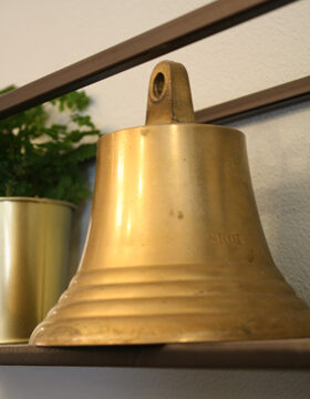
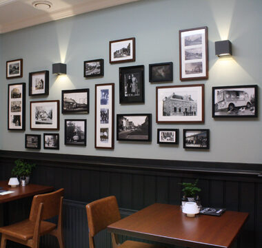
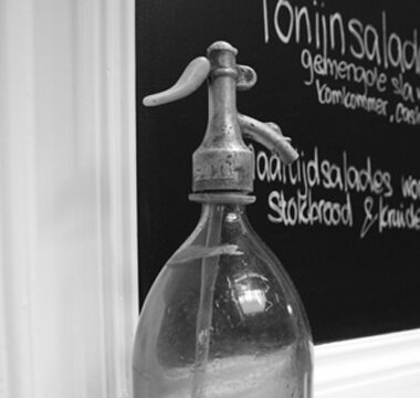
Many existing elements and materials have been reused, such as the table tops, the old bar/wall unit, chandeliers and parts of the existing oak floor. Using techniques such as different finishing, painting in a fresh colour or combining with new materials, these items have been recycled and integrated into the new interior, accenting the concept of a ‘touch of vintage’.
The various restaurant areas with different atmospheres offer space to both clients waiting for the take-away service as well as guests intending to sit in. The whole merges seamlessly.
Client
Astoria Haren
Status
Completed


